

Fun With Fonts
The BMOW display circuitry supports bitmap fonts, with each character on an 8×16 pixel grid. When I first built the hardware, I used an 8×16 font from X-Windows, but I never cared for it much. Here’s what it looks like:
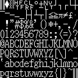 It’s a serif font, more at home on a printed document than on a computer screen. Notice how lower-case hij all run together, as do klmn, #$, and other font glyphs. Zero is taller than the other numbers. The period/decimal point is in the left portion of the glyph cell instead of centered, which looks very odd for a fixed-width font when it’s used as a decimal point. All the character strokes are one pixel wide, giving it a narrow feel. There’s one pixel of empty space between most characters, horizontally and vertically, so it also feels a bit crowded.
I decided to try some new fonts to replace the X-Windows one, but 8×16 fonts aren’t common. Instead, I tinkered with some classic computer fonts.
 This is a slightly modified version of the character font from the Apple II series of computers. The Apple II font glyphs are 7×8, so I inserted an extra empty column into each glyph, and scaled it up to twice the original number of rows vertically, to get 8×16 glyphs. Like the X-Windows font, all the character strokes are one pixel wide, giving it that same narrow feel. The characters themselves are also pretty narrow, with most being only 5 pixels wide, providing 3 pixels of space horizontally between adjacent characters. Most characters are 7 pixels tall (14 after scaling), leaving 1 pixel (2 after scaling) of space vertically between adjacent characters. A lower-case letter with a descender will actually touch a capital letter on the line below it. I burned this into BMOW’s character ROM and played with it for a bit, but it just didn’t look right.
 Ah, this is more like it. This is the 8×8 font from the Atari 8-bit computers, scaled up to twice the height vertically, to get 8×16 glyphs. It’s big and bold, with all the character strokes two pixels wide. The characters themselves are wider too, with most of them being six pixels wide, providing two pixels of space horizontally between adjacent characters. Most characters are actually shorter than the Apple II ones, though: 6 pixels high (12 after scaling), leaving 2 pixels (4 after scaling) of space vertically between adjacent characters. I burned this into BMOW’s character ROM, and was fairly happy with the results. My only real regret was that by scaling up an 8×8 font to make an 8×16 font, I was effectively throwing away half of BMOW’s vertical resolution.
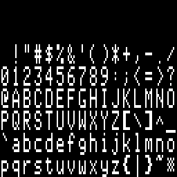
 My solution was to retouch the Atari font by hand, taking advantage of the addition vertical resolution compared to the original to make curved edges look smoother. You can see the result here. In the process of smoothing the letters, I actually made them slightly bolder than they were before, so now this is an extra-bold in-your-face style font. I’m pretty happy with it overall, as it’s nice and legible, and has a good retro-8-bit style to it.
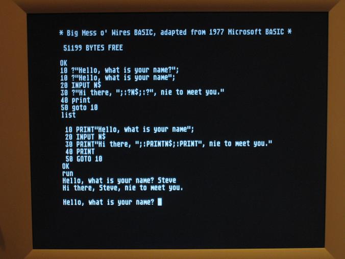
Here’s a photo of BMOW running MSBASIC with the final font:
17 Comments so far
Leave a reply. For customer support issues, please use the Customer Support link instead of writing comments.
Wow. It’s just beautiful. Classic and elegant.
Not long after I took this photo, I also fixed the problem that was causing an extra space to appear before numbers. So now “51199 bytes free” and the line numbers in the program listing will appear correctly. Hooray!
Amazing! A real show stopper.
I must say your designs are definitely amazing.
And definitely what he said before.
Good to see that comparison of character sets. As it happens, I’ve been working on my UK101 character set recently — it’s the 30th anniversary of the Compukit UK101 this year: http://www.gifford.co.uk/~coredump/uk101.htm
The UK101 font is basically 8×8, but stretched on the screen by doubling each row (the hardware counter chain causes each scanline to be repeated). I fitted a bigger EPROM (2732) back in 1985 to allow the use of an 8×16 font without repeated scanlines. Anyway, if you’re interested in the UK101 character generator ROM, do let me know!
If you’ve got the 8×16 UK101 font in a format like the images above, or some other handy format, that would be great!
The font looks a lot like the beautiful Atari ST system font (8×16).
I’m rather surprised you didn’t try making your own font. Low-res 8-bit pixel fonts are easy to make in MS Paint even. 🙂
Hello there, Steve, nie to meet you.
Thanks for this post. I was trying to see if an 8×16 font my work better for my game than an 8×8. Now at least I have some imagery to pack up that hypothesis.
cool man, i really like that final font..is that available to be shared?
Sure, go ahead and use it. That’s the full resolution font bitmap shown above, but you’ll need to write your own code to chop it up into letters.
Oh, lol, I thought you already had a .ttf available… I don’t really know how to make fonts, all good. Thanks though.
Hi, is this font available to use? I’m looking for something to use on 128×64 OLED displays about 1″ wide. The default font is 5×7 in a 6×8 cell. glcd provides that but when scaled to “size 2” it looks crude and awkward because it just doubles pixels and doesn’t take any advantage of the extra resolution to smooth them.
I’d be happy to share the results of my port to Arduino and small OLEDs.
Thanks
Bruce
You’re welcome to use the font, though I can’t help with format conversions for the OLED display.
OK, I saw the other post. I have grabbed the 256×256 PNG and if the pixels are faithful I should be able to convert it from there. Hopefully you saved me a bunch of time in an editor…
I wonder if you can have the larger font and scale it down for 5×7 rather than the other way round? Storing both fonts on an Arduino gets a little big. Hmmm… have to try it. I can imagine how the shrunken font might get savaged… might need some smart algorithm not suitable for Arduino…
Hi,
I know this is an old thread but I thought worth a try. I am after a copy of the Character Generator ROM for the UK-101. Anyone can help out, either a soft copy which I can burn to an EPROM or a ready programmed EPROM.
If anyone can help out, my email is eliamady @ yahoo.com
Remove the spaces 🙂
Thanks,
Elia
Hi,
What\’s the name of the font pictured in the first image?
Thanks!
Cat